Reportly
B2B SaaS Web App
Reportly provides a quick and collaborative way to create aesthetic reports with automated data import and custom branded templates and layouts.
Role: Product Designer
Contributions:
- User interviews
- Affinity mapping
- Competitive analysis
- User personas
- Wireframes
- Prototype
- User testing
- Visual design
- Presentation
Team: Solo
Year: 2022
Introduction ✍🏻
As one of my UX/UI bootcamp projects, I was tasked with finding an opportunity to improve a workflow with a tailored product to be launched as a SaaS desktop web app.
User Interviews 💬
I started the discovery phase by interviewing various people about their day to day at work. I created an interview guide and set up in-person and phone call interviews.
After some initial interviews, I found that several people create reports regularly at work. I decided to narrow down the range of the interviews to this topic and recruited relevant interviewees to get more insights on creating reports at work.
I interviewed 12 people in total, males and females, working in tech-forward organizations, aged 26-35 years old.
Interview Guide
First phase:
- Tell me about your job.
- Walk me through your day at work today.
- Is this your typical day at work? If not, walk me through your other recent day at work.
- Tell me about the tasks you do.
- Tell me about the tools you use.
Second phase:
- Do you create reports at work?
- What tool do you use?
- Walk me through your process of creating reports.
- Do you have any challenges with this?
Research Findings 🔍
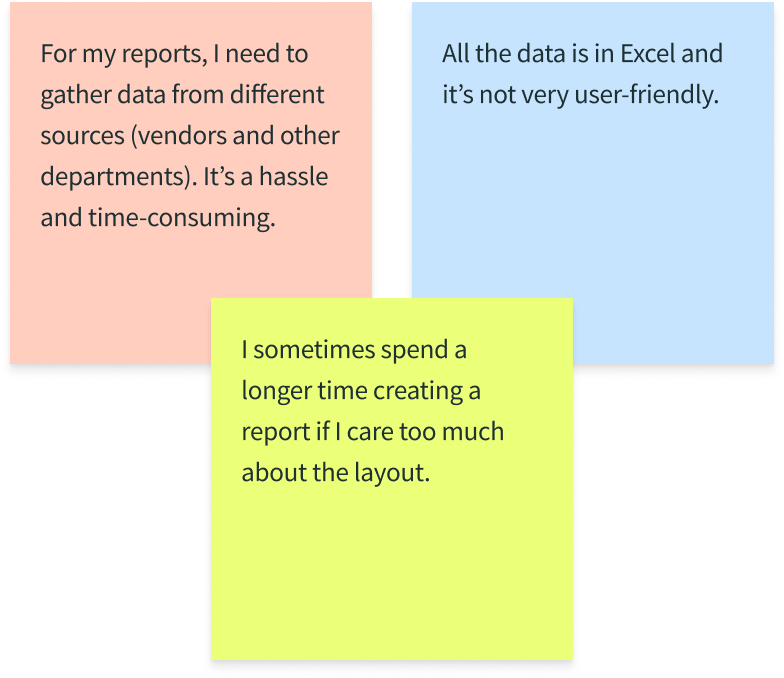
Seven out of 12 interviewees create reports regularly at work, and they mentioned their frustrations with it. By doing an affinity map to synthesize the data from the user interviews, I found a recurring problem:
Problem Statement 📌
Based on the research findings, I identified the problem statement:
Employees who regularly create reports involving numerous steps of gathering data from different sources and make them visually pleasing find it to be a difficult and tedious process. They want to be more efficient and focus on more important tasks.
Competitive Analysis 📊
I did an audit of some of the tools in the market that people use to create reports (PowerPoint, Power BI, Google Slides, Google Data Studio, and Canva) analyzing their features before strategically designing my product.
User Personas 👤

Monica | Primary Persona
26 years old
Marketing Communications Strategist at Socialty
Lives in Amsterdam
Goal:
- Create clear and visually-pleasing social media campaign report every month
Frustrations:
- Spends a long time copy-pasting numbers from different Excel files to her report in PowerPoint
- Doesn't know how to design

William | Secondary Persona
30 years old
E-Commerce Manager at Socialty
Lives in Amsterdam
Goal:
- Have quick access to the reports submitted to him from different teams
Frustrations:
- Has to scour through his emails to find the reports submitted to him
- Loses track of the old reports, buried in his inbox
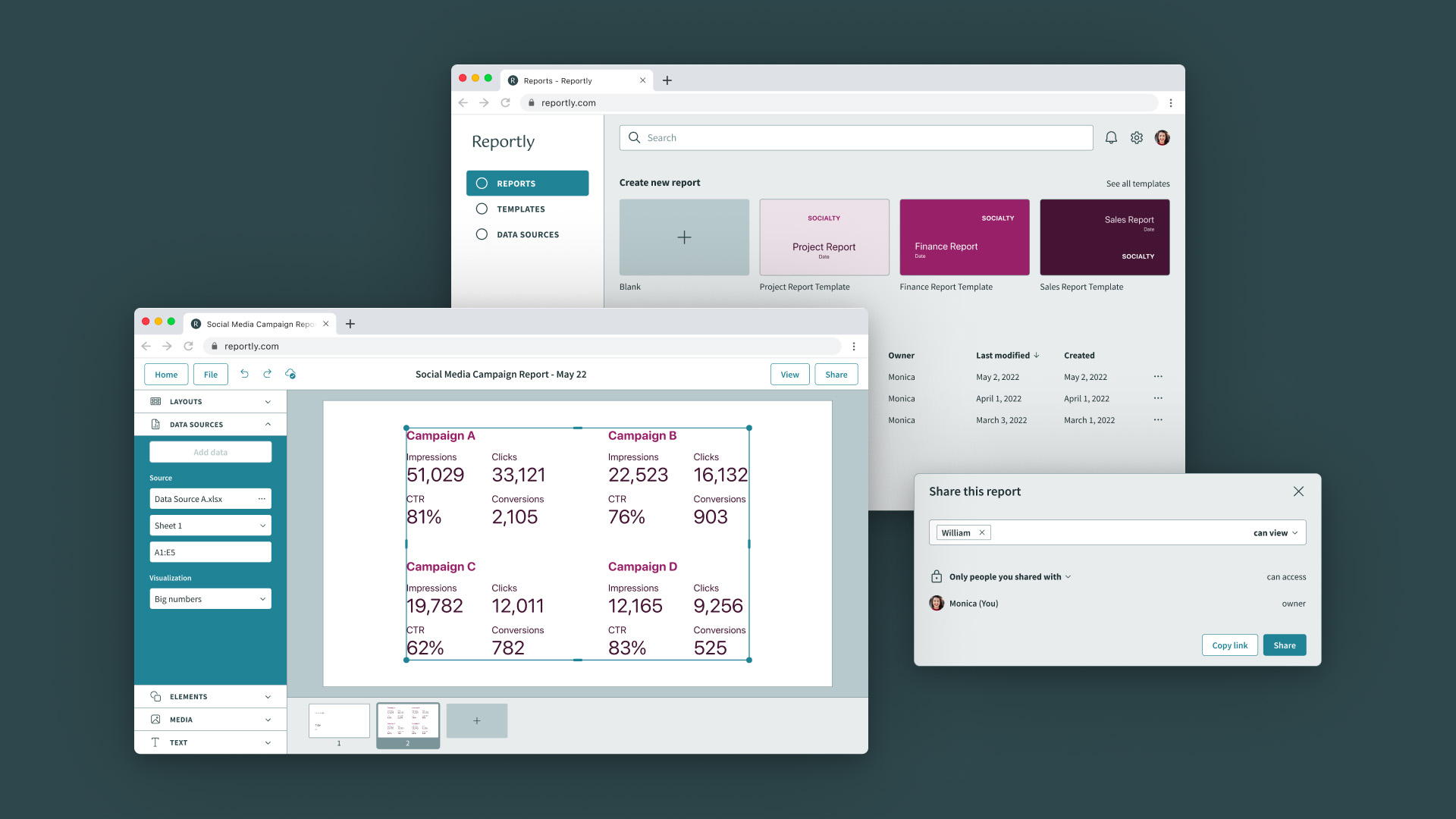
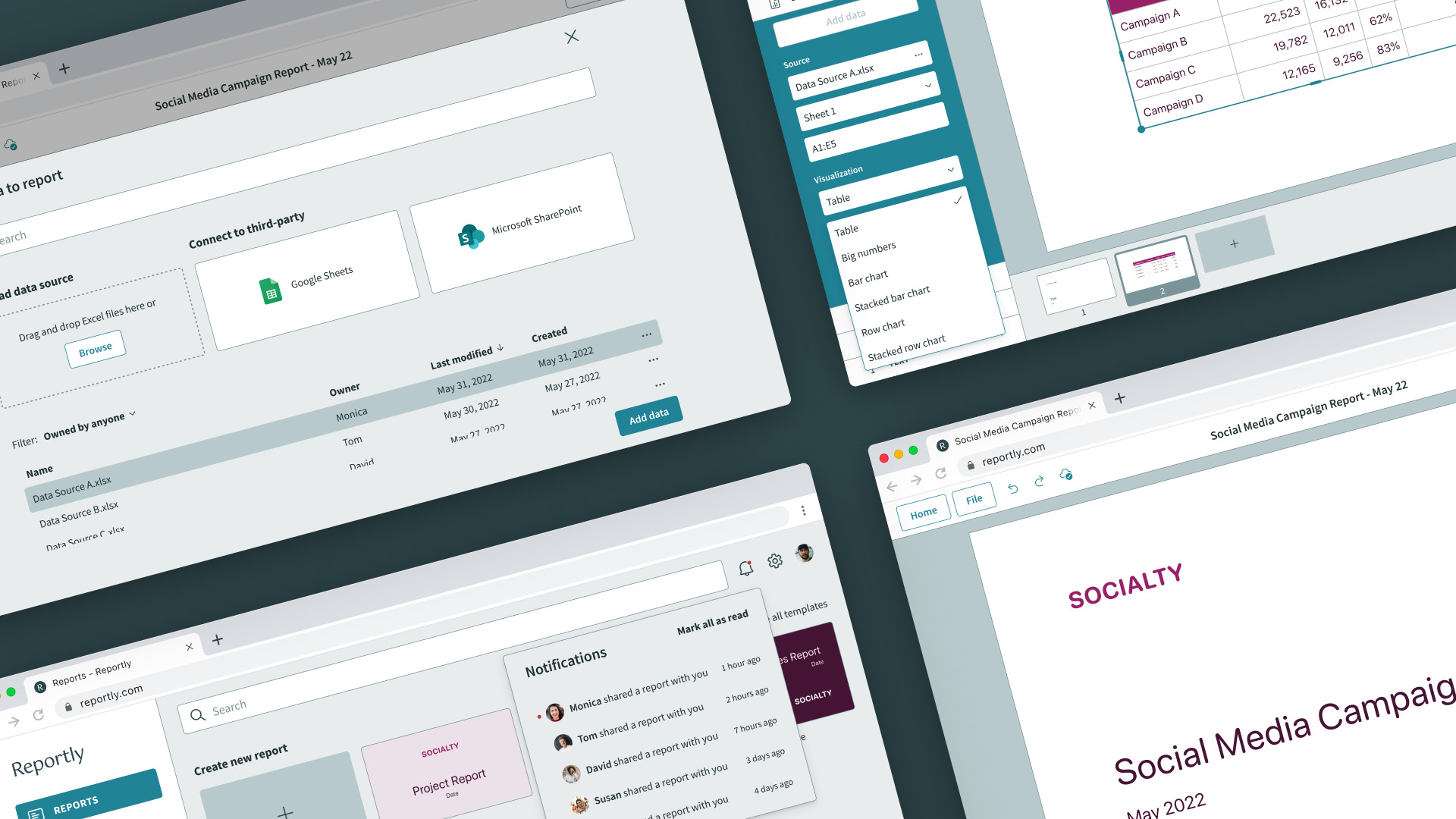
Prototype 🚀
It's time for Monica to create her monthly social media campaign report and submit it to her manager, William. She needs to gather data from different Excel files and create a visually-pleasing report.
William opens Reportly to review the report submitted by Monica.

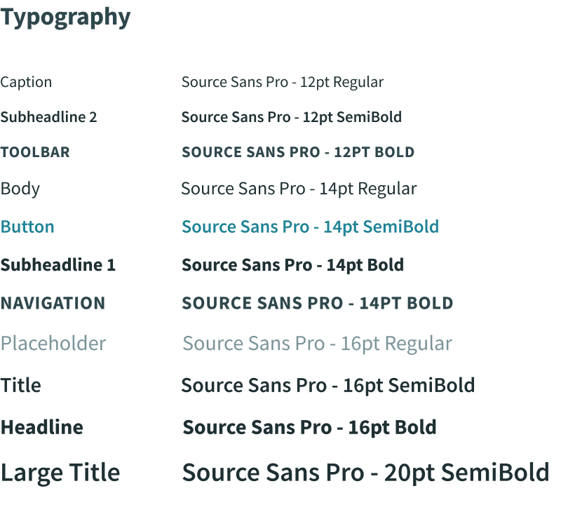
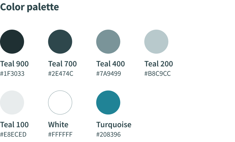
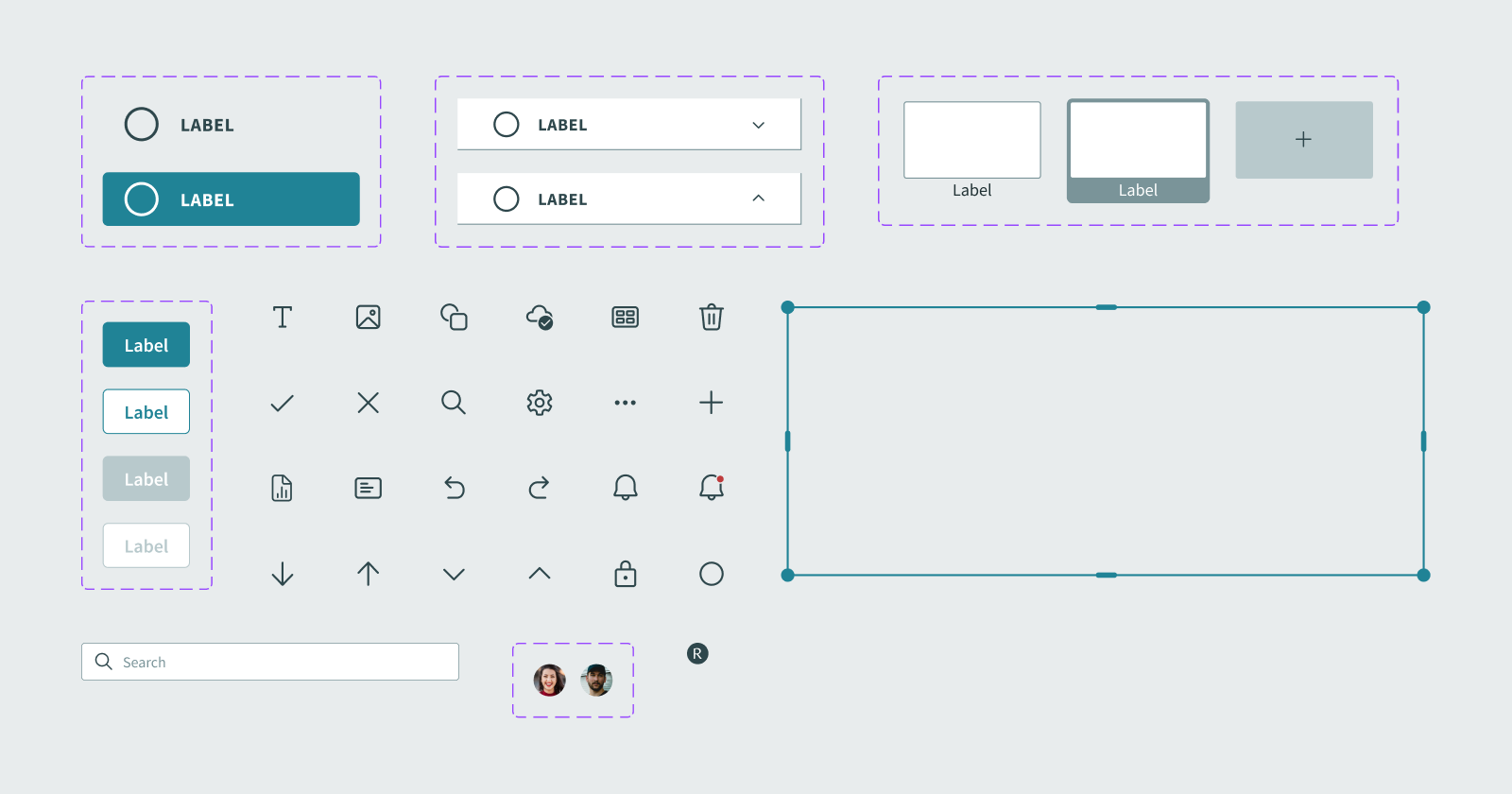
Style Guide 🎨
Components 💠
Design Iterations 🔄
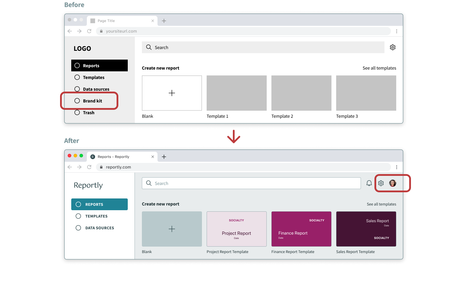
1. One of the feedback from the usability testing was that not all users should have access to modify the Brand kit, so I added an Account section and moved Brand configuration into it, accessible only to the admin.
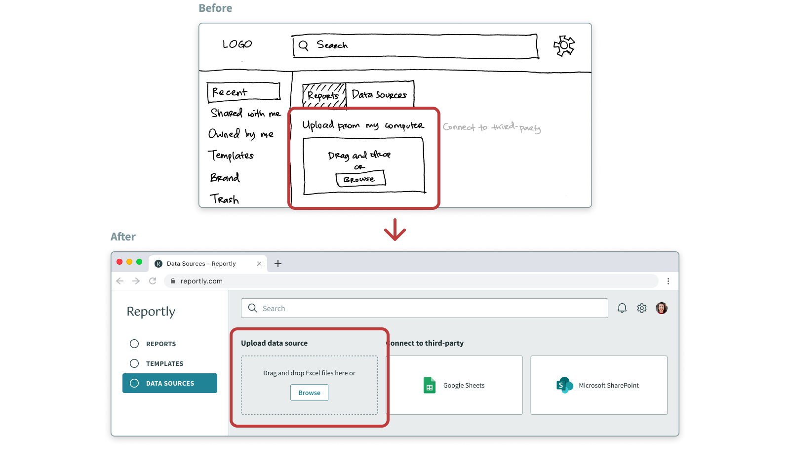
2. It wasn't clear to the users what file format of data sources was supported, so I added that information.
3. I reorganized and renamed the Navigation bar to improve Information Architecture because the initial Navigation labels weren't very clear to some users.
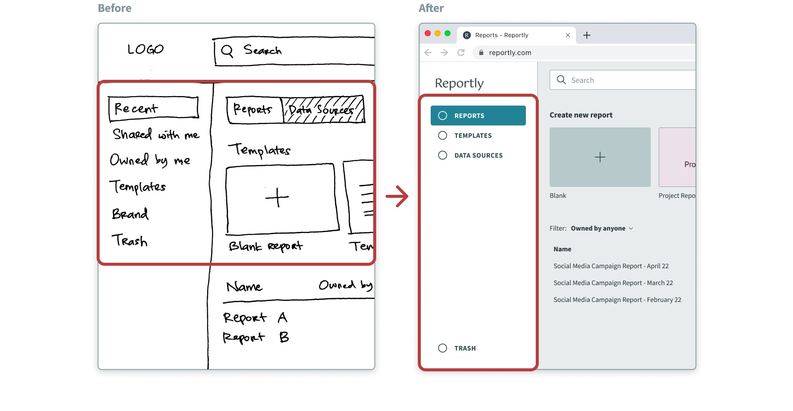
4. It's overwhelming for the users to see all the tools at the same time so I categorized the Toolbar items into different sections to reduce cognitive load.
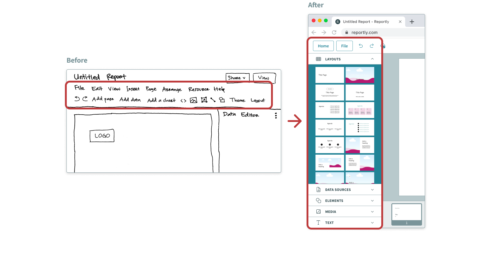
5. The active Toolbar tab wasn't clear for the users because it blended in with the background color of the section, so I changed the color. I also added Chevron icons to the tabs to emphasize that they're expandable.
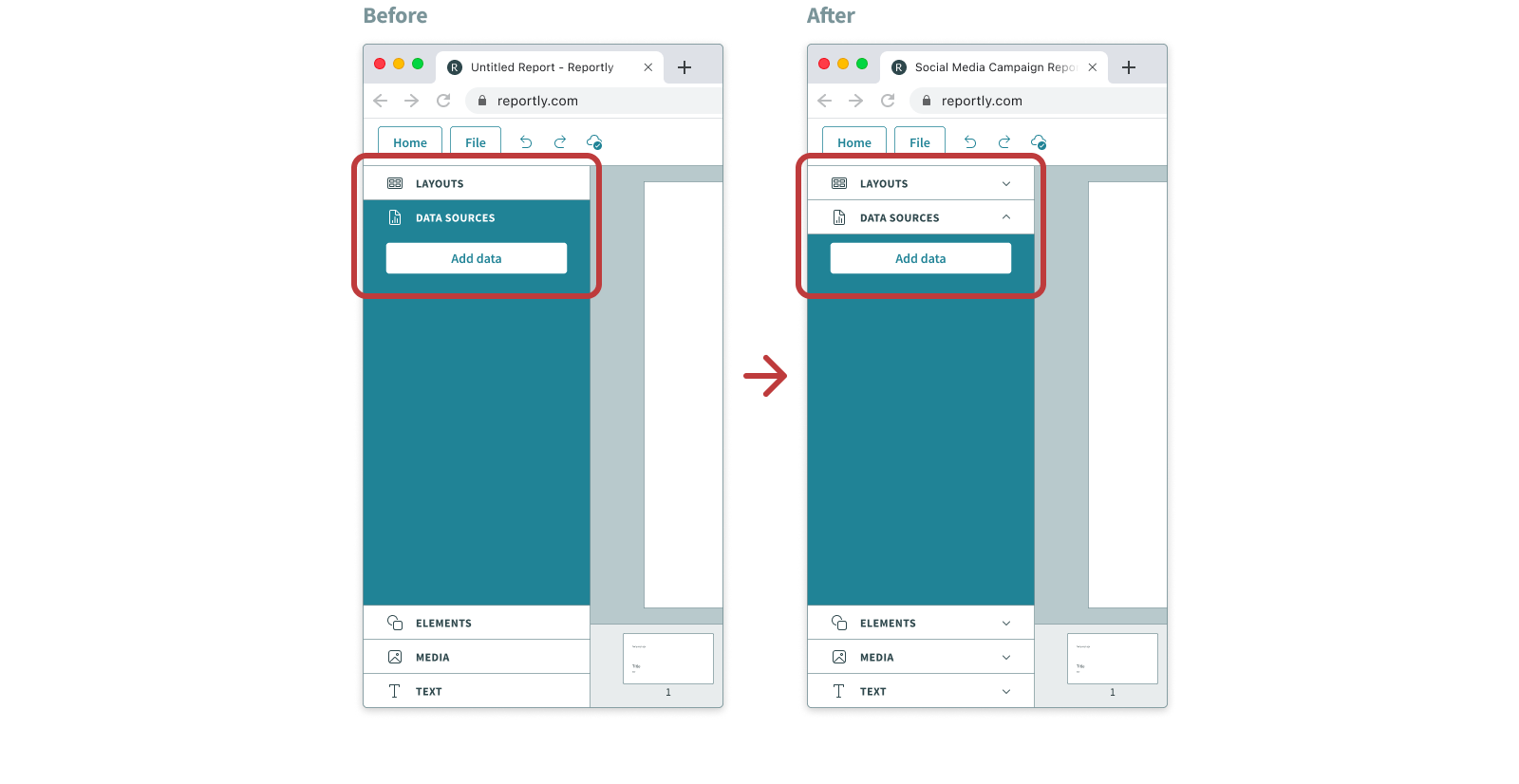
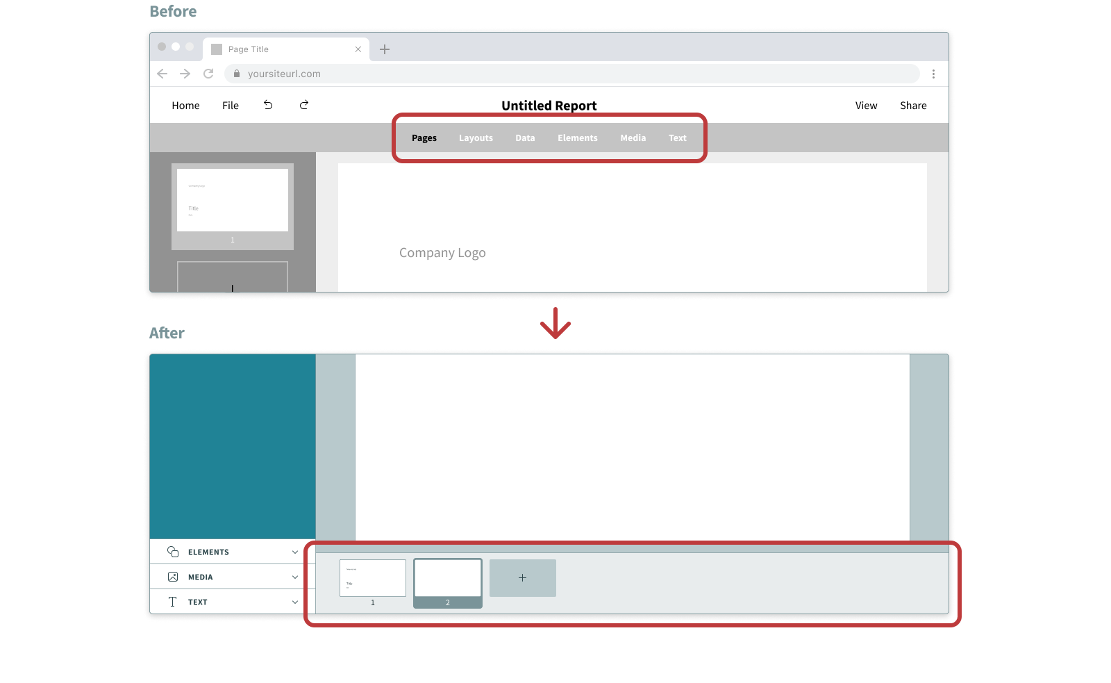
6. Users wanted to always see the Pages section while doing actions such as importing data, so I separated the Pages section from the Toolbar.
Conclusions 💫
Reportly helps to create aesthetic reports in a quick and easy way by providing automated data import and custom branded templates and layouts.
The collaborative feature lets any team member create and share reports, upload data sources, and also to view reports and keep track of them.
Business Model 📈
Reportly uses a subscription business model to generate revenue. It offers two pricing options:
Basic subscription
- Limited options of custom branded templates and layouts
- Maximum limit of 10 user accounts in one organization
Pro subscription
- Many more variations of custom branded templates and layouts
- Unlimited user accounts in one organization
- Teams and folders creation
Roadmap 🏃🏻♂️
Current MVP feature list
- Automated data import from Excel files, Google Sheets and Microsoft SharePoint
- Custom branded templates and layouts
- Collaborative feature
Future features
- Ability to select specific cells of Excel files when importing the data
- Ability to customize each data visualization
- Categorized custom branded templates and layouts with a search function
Thank you for reading my case study, any feedback is greatly appreciated. Let's get in touch! 💬