Dow Jones Risk & Compliance
Risk Profile Page Redesign and Design System
Redesigning a data-dense, financial crime compliance product to enhance its usability and accessibility, and building its design system.
Role: Product Designer (UI focused)
Contributions:
- Discovery
- Design competitive analysis
- UI audit
- Design direction
- Visual design
- Prototype
- Design system
- QA and UAT
Team: 2 Product Designers, Product Manager, Accessibility Lead, Design Systems Designer, Developers, Researchers
Year: 2023
Introduction ✍🏻
Background
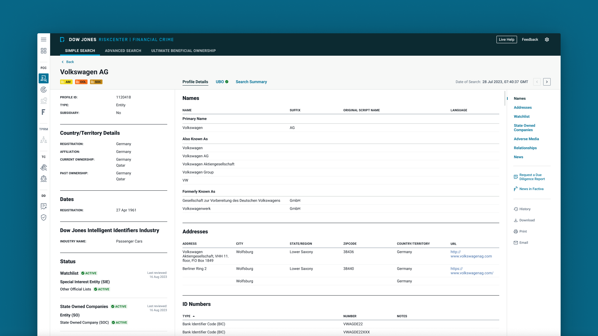
RiskCenter Financial Crime is a B2B product from Dow Jones, offered under its Risk & Compliance division. It is designed to support due diligence on potential customers, ongoing monitoring, and sanctions screening. The primary users are financial institutions seeking to ensure regulatory compliance. Typical tasks include searching the database for risk profiles and assessing them to make informed decisions. The product was launched in the early 2000s and had its first redesign in 2018.
Challenges
Through user feedback and our internal evaluation, we identified several problems with the current risk profile page:
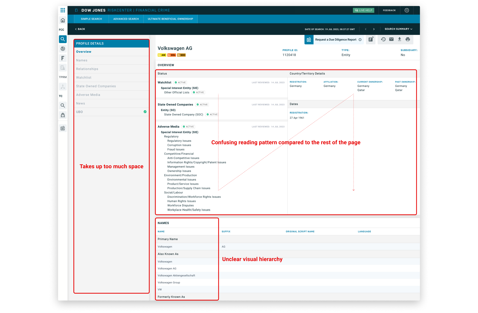
- Excessive blank space and low information density made it difficult for users to efficiently assess risk profiles.
- 15% of users continued using the legacy application because it provided better data density.
- The interface lacked a clear visual hierarchy and had a confusing reading pattern.
- Accessibility issues included insufficient color contrast, missing ARIA and role attributes, and keyboard navigation problems.
- The UI felt outdated and was not built on a design system, leading to inconsistency and maintenance difficulties.
Solutions and Goals
We analyzed the problems and aligned on key solutions:
- Optimize information density
- Improve information architecture and visual hierarchy
- Comply with accessibility
- Modernize UI
- Build design system
Our main goals were to:
- Enhance user workflow efficiency
- Increase user satisfaction
- Fully migrate all users from the legacy application
Design Process 👨🏻💻
I partnered and worked in parallel with a Product Designer focusing in UX. While they initiated their process with a content audit, site map, user flows, content massing, and then wireframes, I started mine with a design competitive analysis, followed by UI audit, design direction, visual design, prototype, and design system. Each of us had our own responsibilities, but we collaborated closely in every step.
Design Competitive Analysis
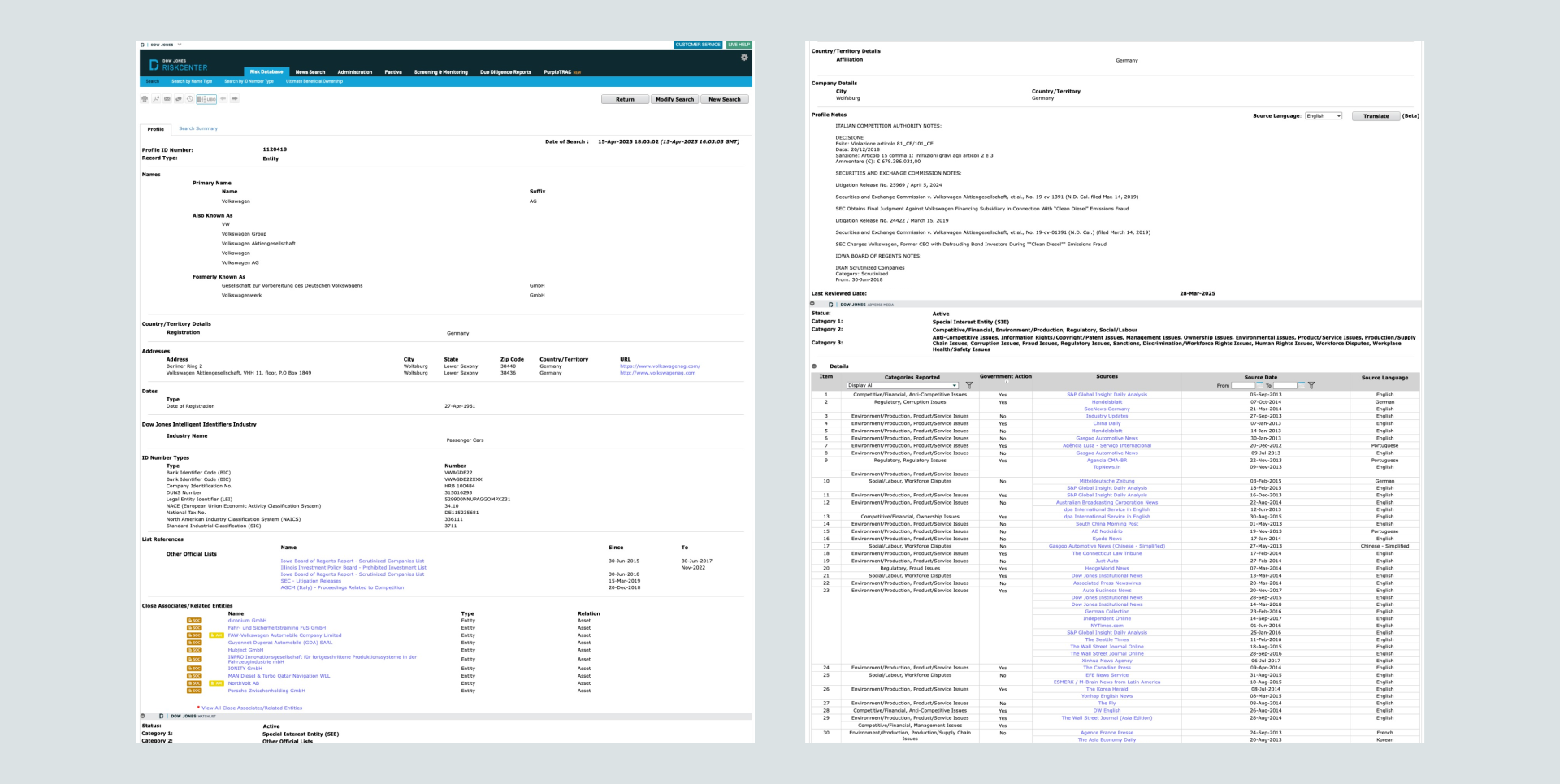
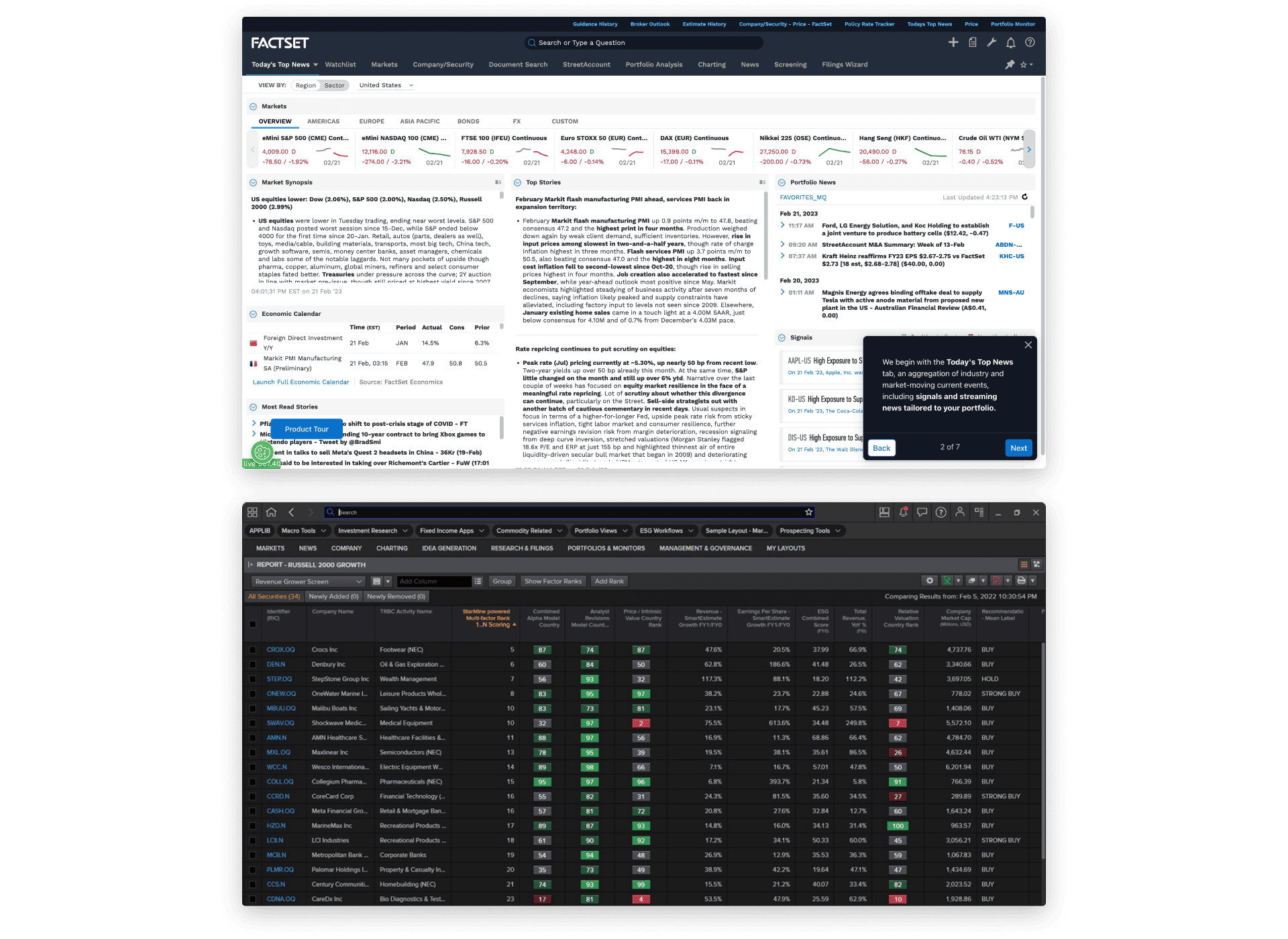
I analyzed the top 10 competitors, among them were Factset and Refinitiv, where I found both providing a highly optimized screen real estate with information density while maintaining a solid information architecture, clear visual hierarchy, and accessibility compliance.
UI Audit
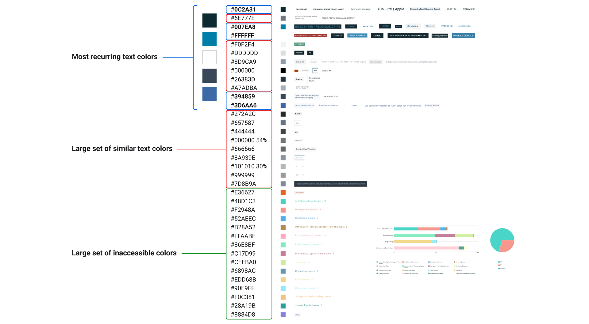
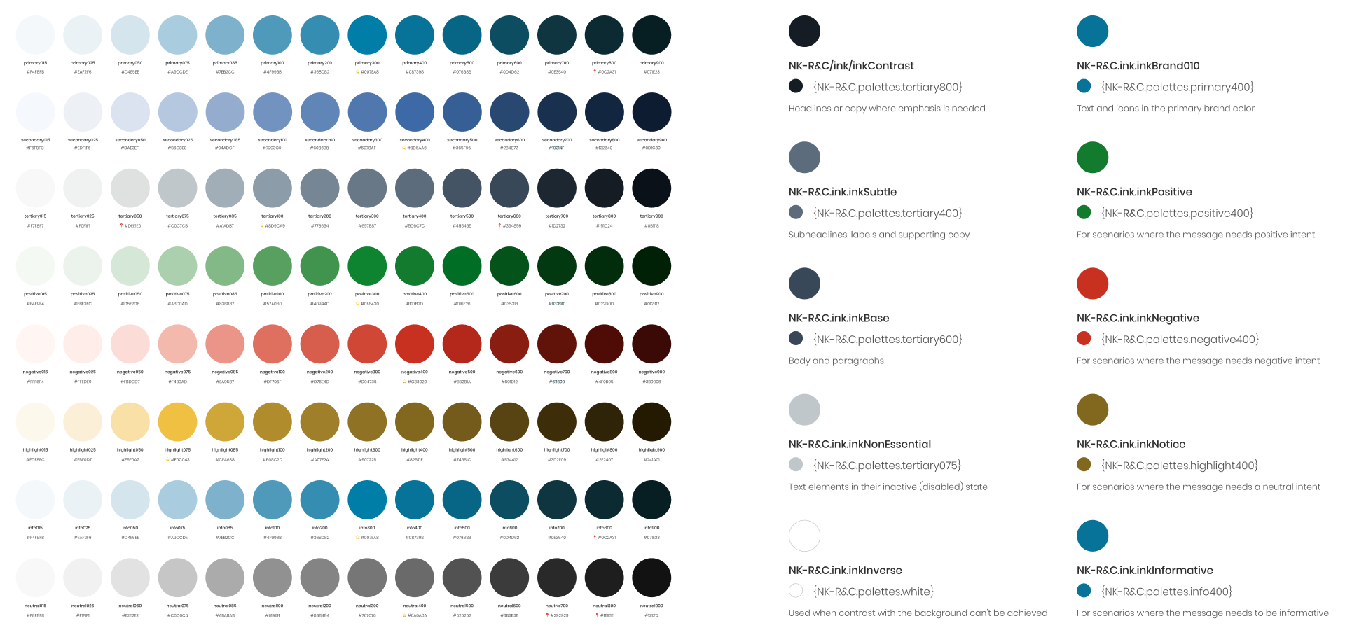
After an extensive audit of the colors, shadows, typography, icons, and grids, plenty of inconsistencies were identified in the UI, predominantly in the colors. We decided to consolidate redundant colors for greater consistency, and make adjustments to ensure all elements have sufficient color contrast.
Design Direction
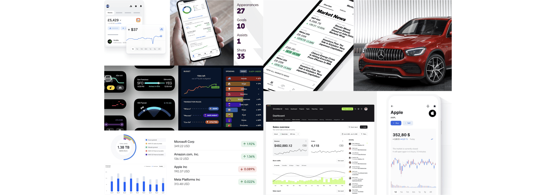
The findings from design competitive analysis and UI audit served to inspire and guide the design direction. The chosen concept of our moodboard was Expert Experience, an experience that conveys a sense of expertise and authority, described by these 3 words: Credible, Authoritative, Functional.
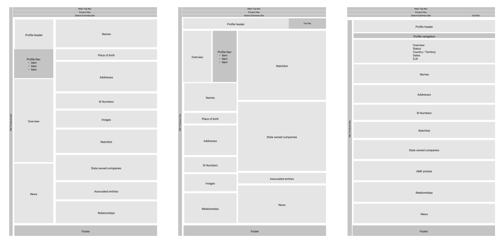
Wireframes
We developed early wireframes with different options of information hierarchy, displaying the most crucial information first for quick assessment. We also explored on dividing the information into 2 panels to optimize the space.
Design Decisions
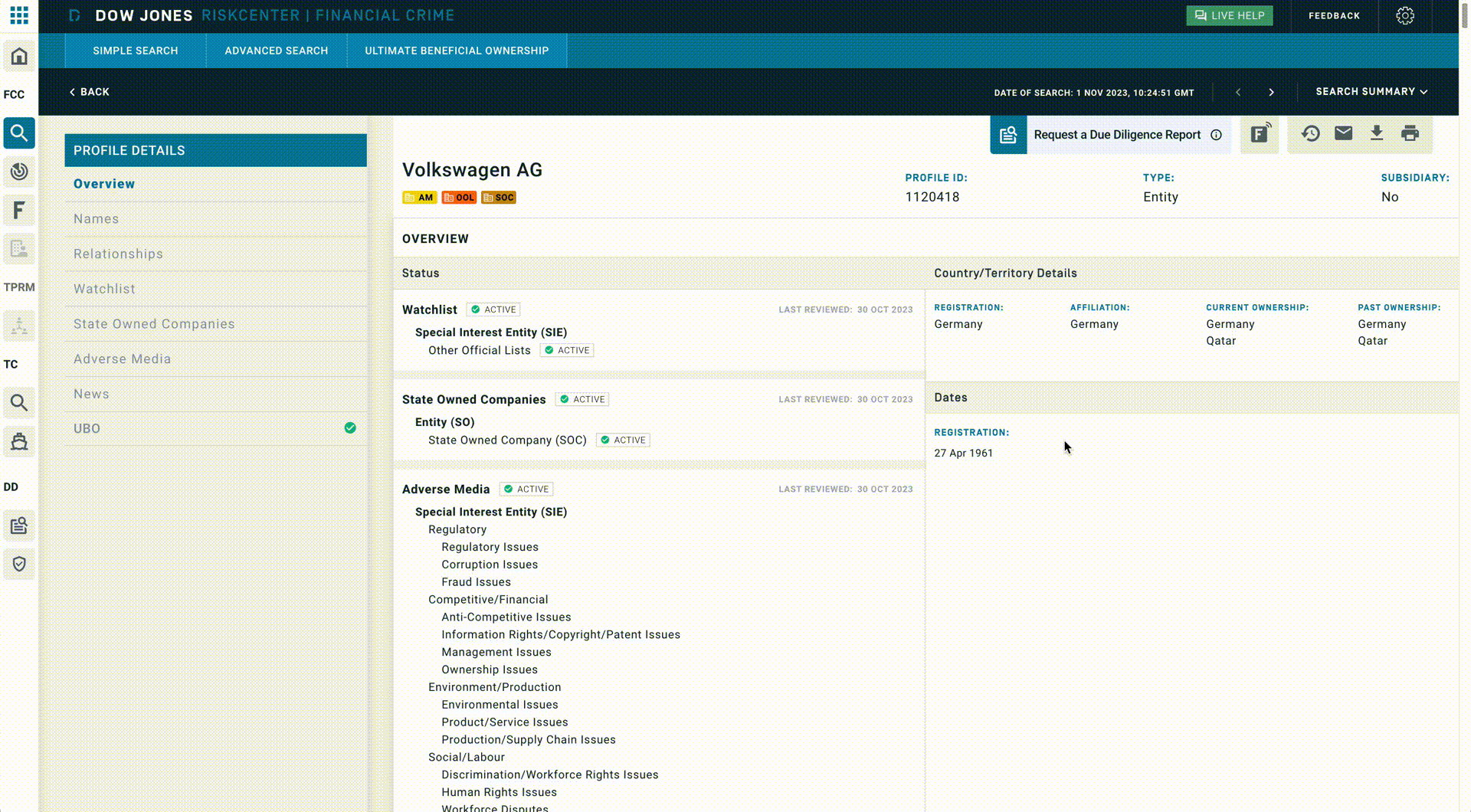
The old global navigation had a clunky look and feel, and some icons didn't accurately represent their corresponding items. I explored icon options to better convey meaning while maintaining style consistency. Improvements were also made to the visual hierarchy.
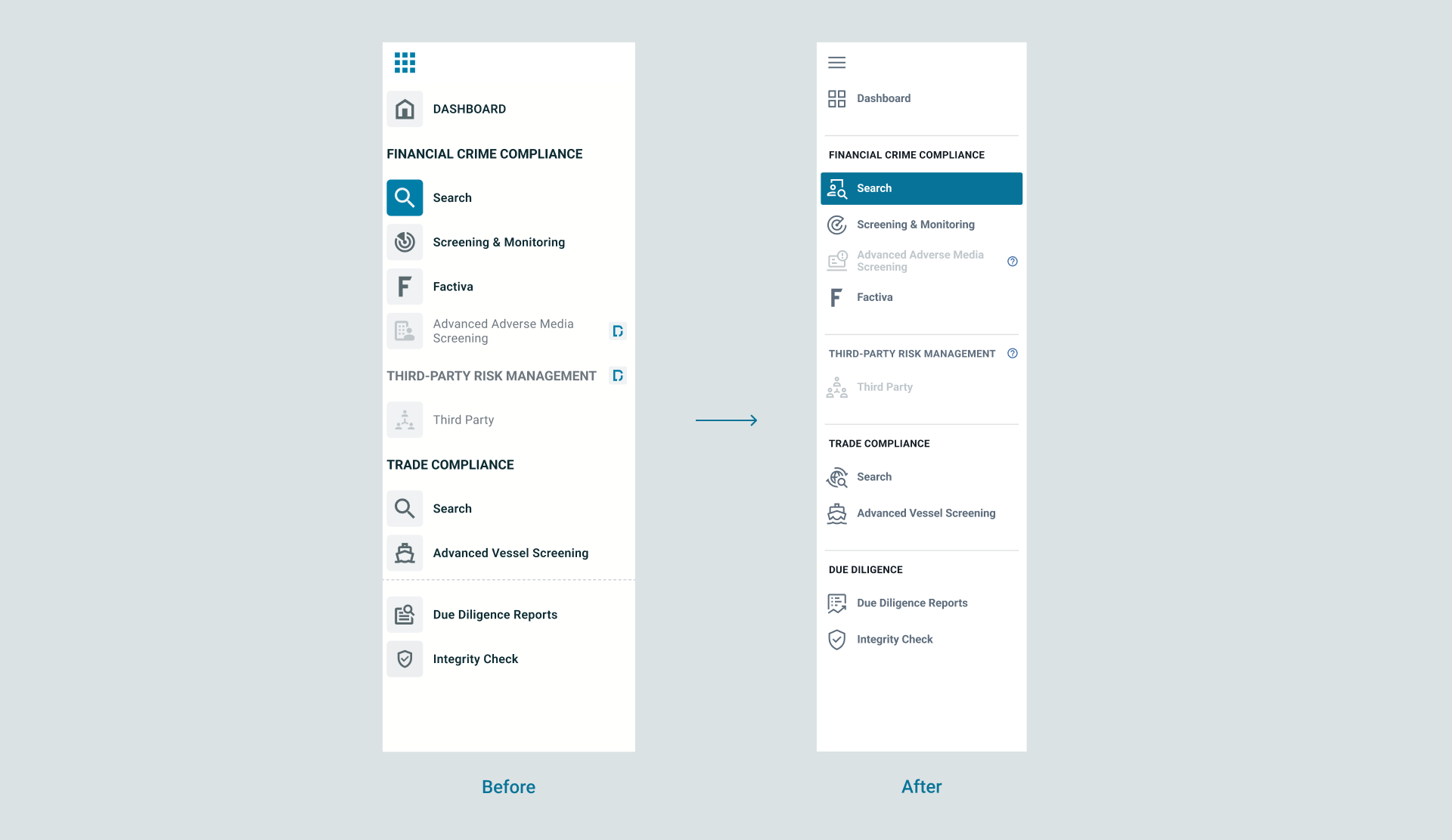
We moved the anchor menu from the left to the right and reduced its size to maximize space for the profile content. I also updated the colors to meet accessibility requirements for color contrast.
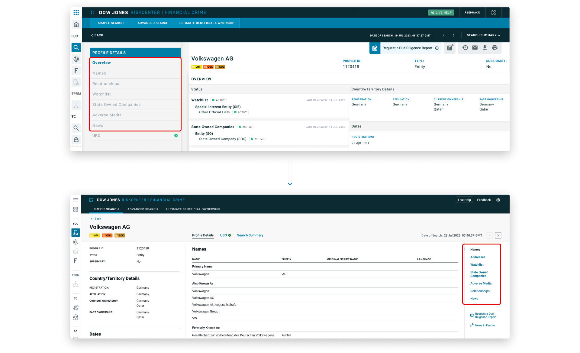
The placement of UBO directly below the anchor menu was misleading, as it appeared to be part of the menu but actually linked to different page content. To address this, we grouped UBO with Profile Details and Search Summary into a set of navigation tabs. This change clarified the menu structure, improved navigation consistency, and made it easier for users to understand and switch between major sections.
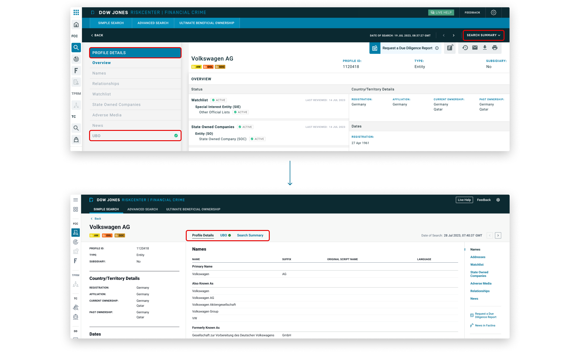
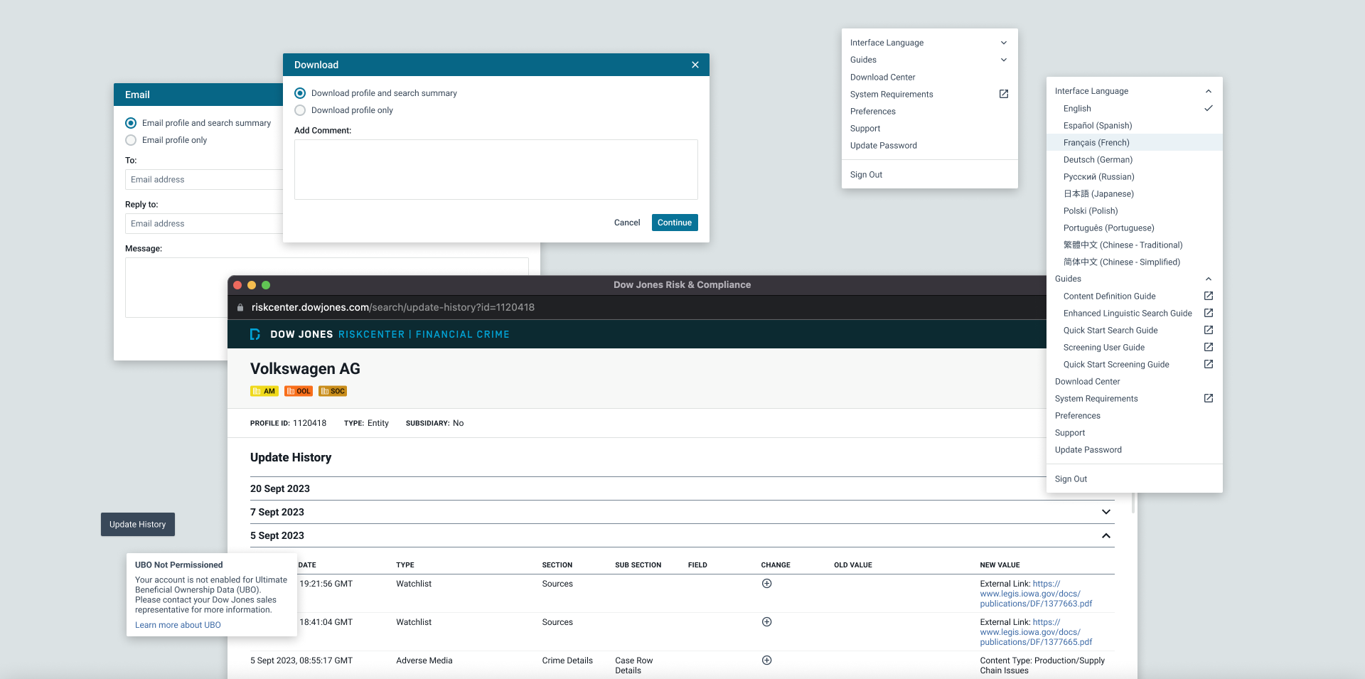
We updated the toolbar to show text labels alongside icons to improve clarity, reduce cognitive load, and make actions more accessible to all users. Localization was taken into consideration, and I ensured there was sufficient space for label translations in all supported interface languages.
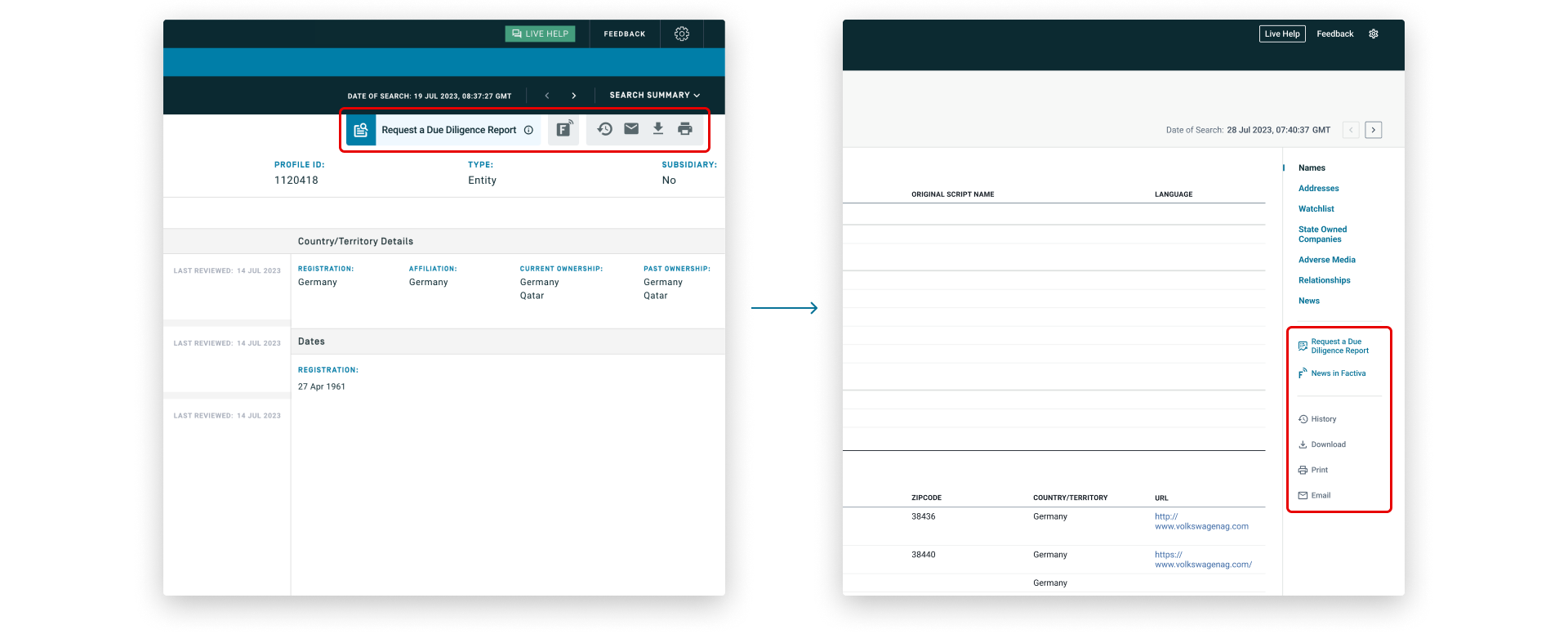
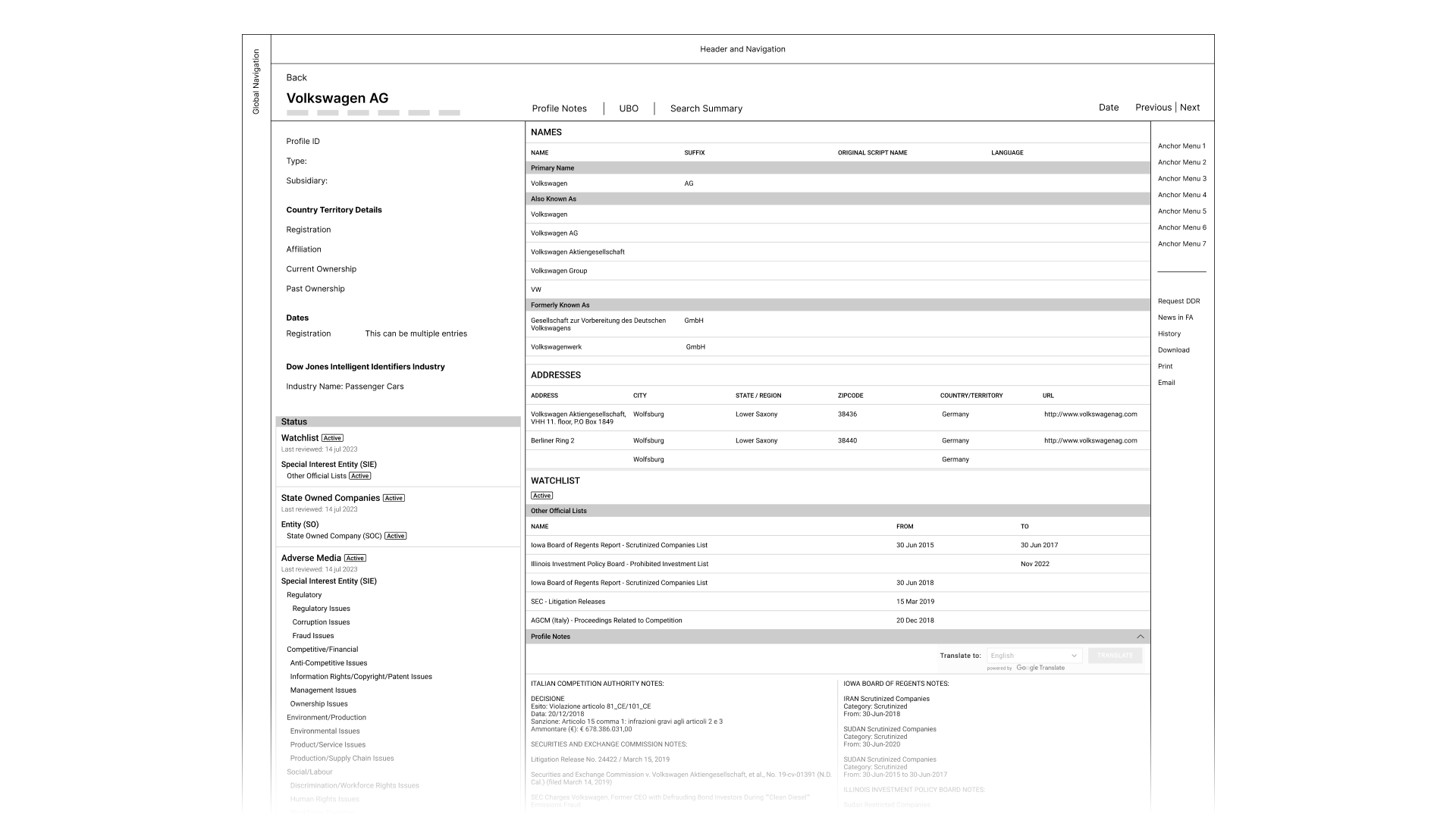
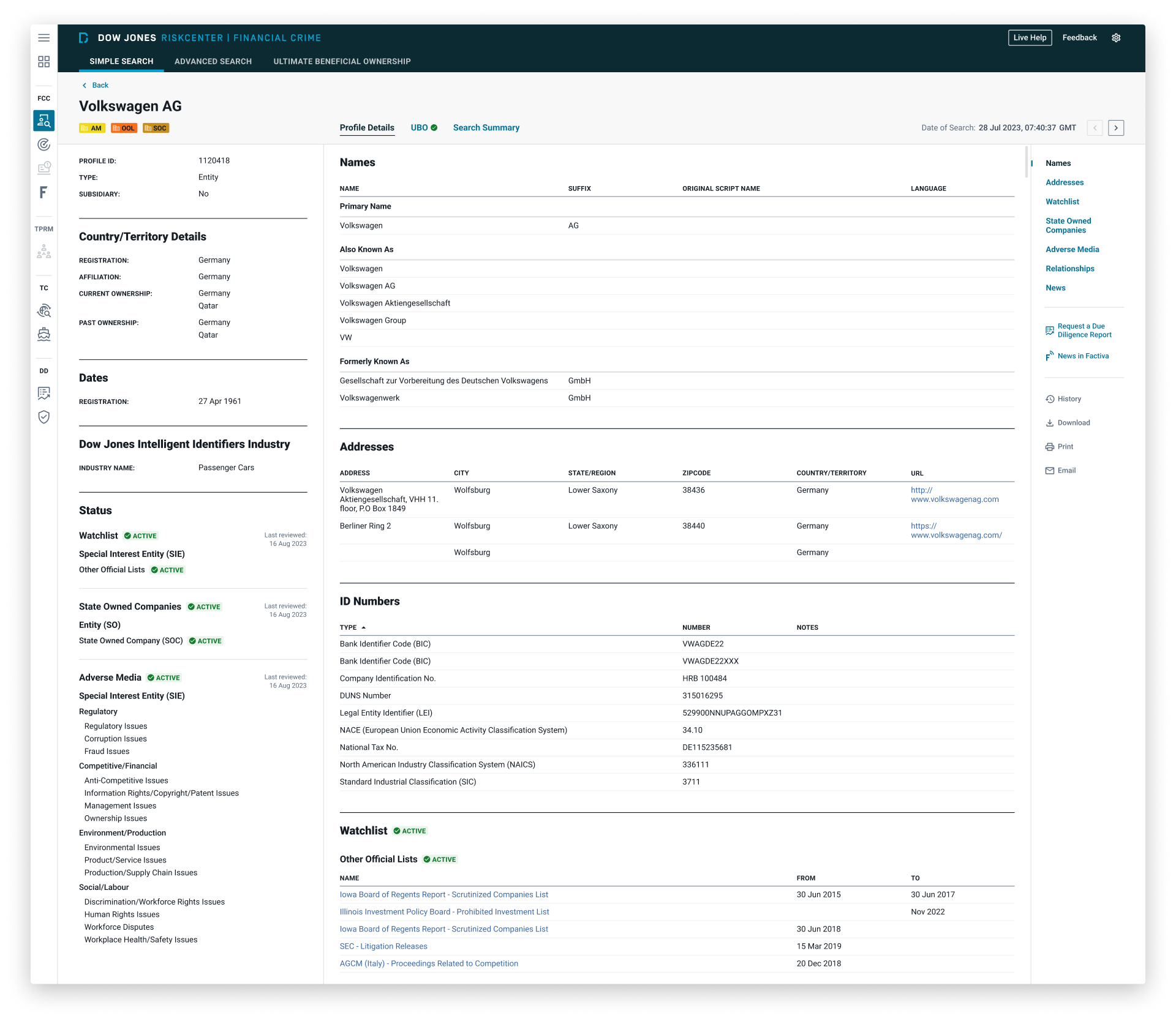
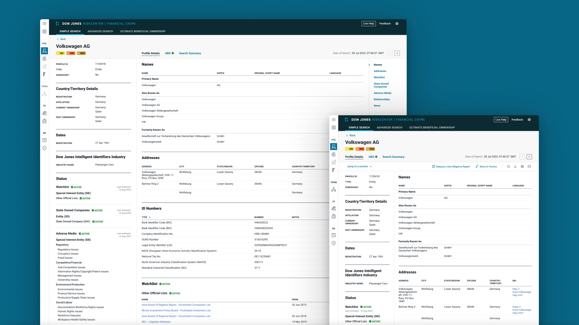
To optimize information density, we split the profile content into 2 panels: the left panel provides a quick overview to help users confirm they have the correct profile, while the right panel contains the detailed information needed for decision-making.
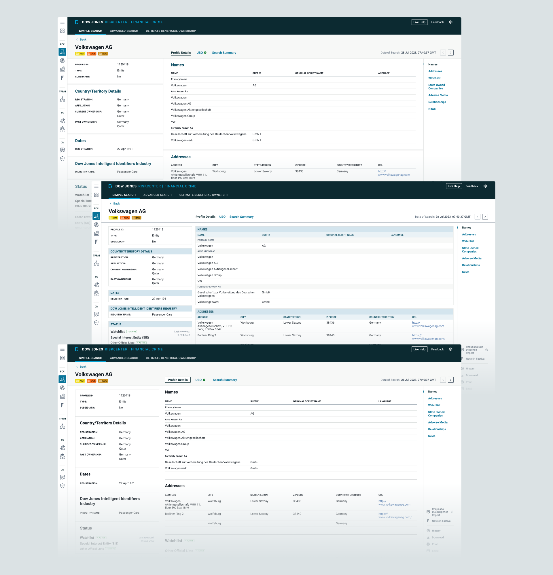
I designed interactive elements (e.g. tabs, dropdowns, and modals), edge case screens (e.g. empty and error states), and responsive page layouts across 5 different breakpoints.
Prototype and User Testing
The design was then turned into an interactive prototype to be tested with user groups in different regions. The results were positive, with users reporting faster task completion times and a more intuitive interface. However, there was feedback suggesting that some key data would be more effective if placed higher on the page, to which we made the necessary adjustments.
Design System
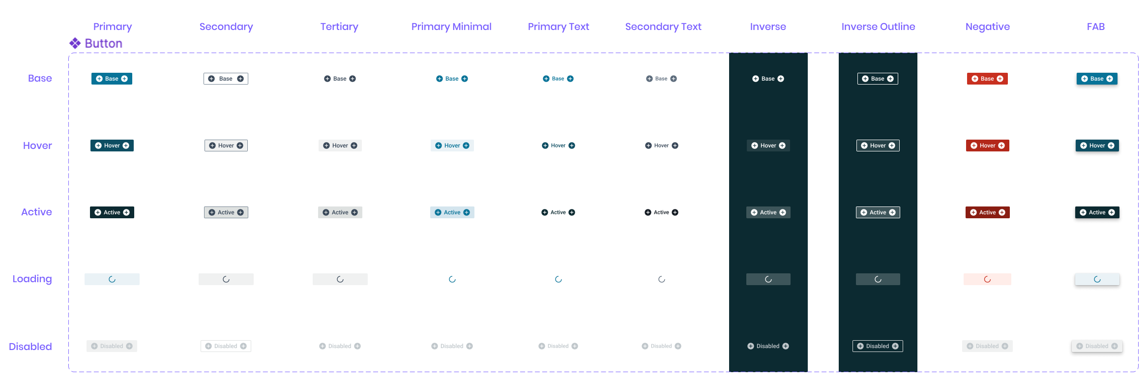
Following the design system framework established by other Dow Jones products, I initiated the design system work by building the foundations, such as colors, typography, elevation, grids, iconography, etc. Based on the color audit that I did previously, I created the core palettes for this product (primary, secondary, tertiary, and so on), and assigned them to the contextual colors (ink, interface, and interactive). Once the foundations were defined, it was time to build the component library. It's important to keep accessibility in mind throughout this process.
Implementation
I conducted QA after the components were built in Storybook and UAT after implementation in each environment to ensure alignment between design and development. Rigorous testing was performed by all teams prior to release. We identified several issues in edge cases and prioritized fixes based on impact and effort, deferring some to post-release.
Results
The project led to several key improvements that were validated through post-release testing and user feedback, aligning with the goals we set out to achieve:
1. Enhanced user workflow efficiency The average time required for users to complete key due diligence and risk assessment tasks was reduced by approximately 20%, based on measured task completion times during pre- and post-release user testing, reflecting a significant boost in workflow efficiency.
2. Increased user satisfaction A post-release survey indicated a 30% increase in user satisfaction. Users highlighted the improved information density and modern, intuitive interface, specifically noting that the new risk profile page allowed them to find crucial information faster and more easily than before, with about twice as much information displayed above the fold.
3. Full migration from the legacy application We successfully migrated 100% of users from the legacy application to the new platform, ensuring consistency and alignment across the user base.
Learnings 💫
The process provided valuable insights and lessons, and here are the 2 key learnings for me:
1. Flexibility in a multi-brand design system Working within a multi-brand design system presented unique challenges. Each brand or product often requires distinct styling, but our shared component library had limited flexibility with tokens. As a result, customizations involved codebase changes, adding time and effort for developers. This experience emphasized the need for thoughtful planning and coordination when implementing design systems across multiple brands, ensuring that design decisions are scalable and sustainable.
2. Implementation challenges During implementation, unforeseen issues can arise, such as edge cases we hadn't accounted for, performance problems, or discrepancies between the intended design and the actual build outcome. Maintaining close communication and building strong relationships with developers from the start helps minimize these issues. It's important to plan for sufficient time to address challenges before release, but when time is limited, prioritization is essential.
Thank you for reading my case study, any feedback is greatly appreciated. Let's get in touch! 💬